At Filament, we’ve iterated on our Steam store page art for our game RoboCo many times in the past. It’s difficult to know what will successfully catch an algorithmic wave, so it’s important to take lessons from past attempts. I’ll walk you through the process we followed to make our latest key art and share my insights along the way.
The key art we used for the longest time incorporated vibrant greens and blues in an imagined scene that was not directly from the game, which looked pleasing, but didn’t convey the gameplay clearly. There was a brief period when, to our chagrin, the key art was AI-generated when AI first hit the market, intending to act like concept art that evokes the mood and feeling of the game without necessarily representing it 1:1. While this image did garner a bump in downloads, the morally repulsive nature of image-based generative AI which has since come to light has caused us to take that image down and avoid using that form of AI technology entirely.
In the latest version, we swapped in a minimalist and punchy key art from our Quest 2 port of the game. It was eye-catching and chaotic, but lacked gameplay information that a Steam audience needs. This time around, we opted to use the key art purely as a chance to show people what the game is to us.
Planning and Thumbnailing
With this history in mind, we set out to create the ultimate RoboCo key art. We first interviewed RoboCo’s most prominent game designer to understand what was special about RoboCo to them and what Easter Eggs we could include in this final key art. We wanted an image that could stay up for a long time and that the team could look back on in the future and remember the best parts of the game in their eyes:
- RoboCo invites joy through chaos
- RoboCo has distinct environments
- Bots can look interesting and not just blocky and gray
- Bots interact with human characters
- Players share their creations
- Sandwiches
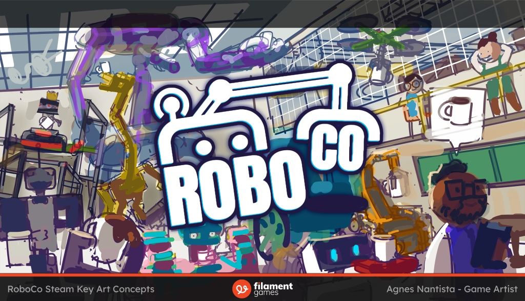
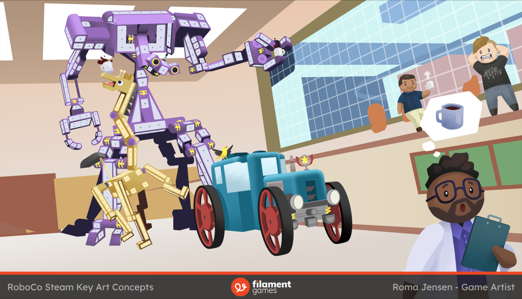
Our brainstorming came down to a scene that had a clear and funny human-robot interaction that shows the diversity of our build system and a glimpse of the larger warehouse the game takes place in.
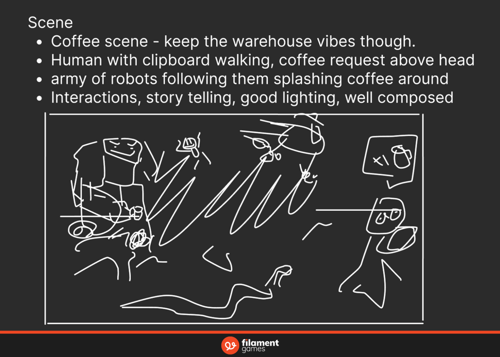
Given this scribble of a prompt from Filament’s art director, I made small thumbnail images depicting this scenario in various compositions. Our goal was to show a wide variety of bots attempting to deliver coffee to the human in front. The mood was “fun chaos,” so I aimed for an overwhelming sea of bots approaching the human.
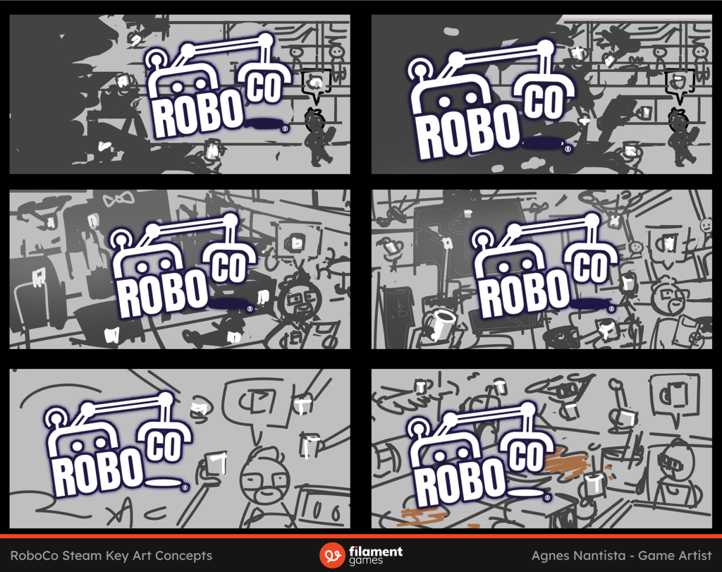
My favorite thumbnail was the middle right one, which allows lots of bots’ faces to be visible while giving a “looming” feeling. It also provides a framework for ordering the bots by size and framing small bots against larger ones. Others liked this one too, so we went forward with it.
Refining the Sketch
The next step was to upgrade the abstract shapes from the thumbnail into understandable objects.
RoboCo is known to me as Filament’s precious baby—one of our few IPs which started production years before I even graduated from college. It offers a highly robust bot-building system capable of unleashing almost any functional, whimsical bot idea born of a creative mind. But when I played RoboCo after joining Filament in 2022, I sucked at it. Even though I literally have a “creative” job, I don’t have the specific creative mind for designing bots. I didn’t get very far in the game and struggled to build any but the most rudimentary bot for each level. So you can imagine the fear I felt when I had to give shape to every bot in this image when I have no idea how to build them! This has traditionally been the hardest part for every Filament artist creating new compelling RoboCo key art so this time we took a new approach.
We assigned each bot silhouette an “archetype” as a starting point; each one would represent a type of locomotion or aesthetic in order to say, “look at all the different ways you can build a bot to deliver coffee/complete a task in RoboCo!”
- Giant (A)
- Flying (B,C)
- Animal (D,E)
- Humanoid (F)
- Simple (G,I)
- Over-engineered (H)
- Car (J,K)
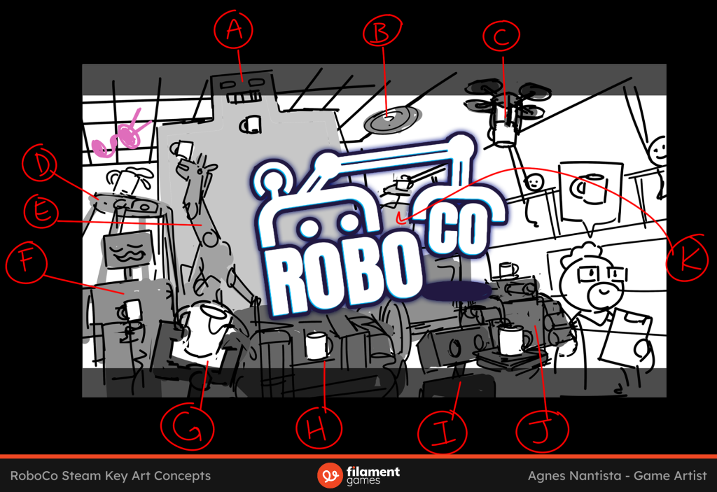
Once we had a direction for each bot, I sketched them in and tried positioning them in interesting ways.
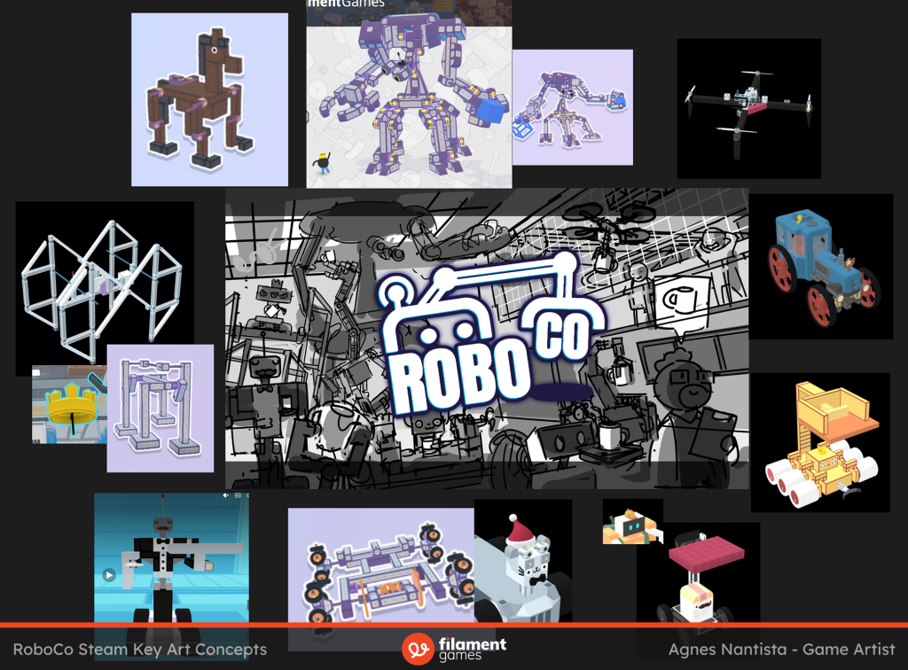
To further refine the sketch, we looked to player creations from the Steam Workshop and some old examples for inspiration. There was much to pull from, and it was wonderful seeing so many fun robots from our players!
Now, even if I am a professed lover of grayscale, I reach a point where I should give thought to color. This is where things slow down and get stilted for me; it’s a big variable I have to wrangle in this complex piece.
On a new Hard Light layer that preserves the values of the sketch, I lay down the most basic ideas I have for each object’s color. Without a specific palette or grouping plan yet, you can see that things look pretty muddy and disjointed now! But that’s OK. Sometimes you need to get the ugly first idea down so you can discover what parts work and what don’t.
Creating the Base
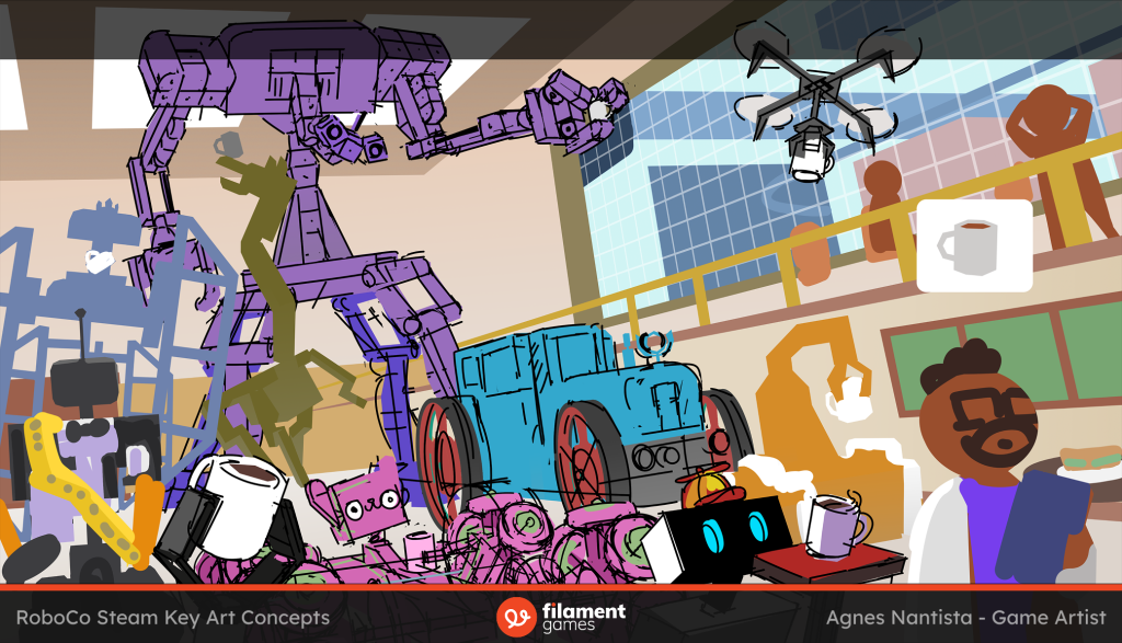
After planning out the objects in the scene, it was time to start making real decisions about what the inside of these silhouettes would be filled with for the final version. This involved getting really specific about each component of the bots and drawing an additional sketch on some to get details correct; the kitty bot’s omni-directional wheels did make me want to scream and wish for a 3D model. The bots that weren’t direct copies required some imaginative constructing from yours truly; I don’t believe they would be functional as they are, but a still image needs only create the illusion of functionality!
I then placed some approximate shadows to simulate the lighting situation and assessed the overall image. The silhouettes seemed well-composed and understandable, but the color distribution around the image needed work.
For reference, I’m a huge fan of the art direction in Monomi Park’s Slime Rancher 2 (please go look at it), so I always find myself trying to push our projects toward the kind of joyful and adventurous color choices it has. And that’s the faint, guiding star that I look to for the rest of this illustration.
The environment for our key art is a cafe for the RoboCo employees, so I wanted it to contrast with the rest of the warehouse seen through the window. The simplest way I could think to do that was to make the cafe look warm and the warehouse cool, which improved the image somewhat, but I felt that the cafe was stuck in a monotonous beige.
While I was using some of my unlimited PTO and traveling for a week, I handed the piece off to our senior artist and asked that she block out the colors on these three bots and the humans. With each color separated into layers, I would be able to adjust them individually when I came back. She did a stellar job, and the level of detail she achieved was a perfect benchmark for the rest of the piece.
Color and Final Touches
I had to decide how to create interest with color and light. RoboCo’s actual game assets are relatively desaturated and flatly lit due to performance constraints, but key art is not bound by the constraints of a game engine. We do still want to look attractive among thousands of games though, and stay true to what the game feels like, so I needed some type of contrast to catch the eye.
My immediate thought was to contrast with light and shadow, but it actually would create two problems:
- With the light in the scene coming from behind, it would create dark shadows on all the bots and look quite looming to the point of scary.
- The numerous harsh transitions between light and dark (due to very few curved surfaces) would make it difficult to tell where one robot ends and another begins, as you can kind of see above. Our brains aren’t evolved to recognize these various robot shapes the way we can instantly recognize a fellow human, a tree, or a dog. So it’s imperative that the bots’ silhouettes stand out from each other.
So if not contrast via values, my other option would be to contrast via color temperature. In this scenario, there are still shadows, but they are only visible enough to suggest where the light was coming from. The value range within each bot would stay contained so that I could say this is a “dark” bot (kitty) that contrasts against a “light” bot (giraffe). This way, the real interest would be the color shifting within each bot.
You can see where I started that with the big purple bot, where I shifted the shadows to bright blue, and then applied this approach to contrast by roughing in the remaining bot. This is when I felt I was moving toward that charming Slime Rancher 2 look I was aiming for!
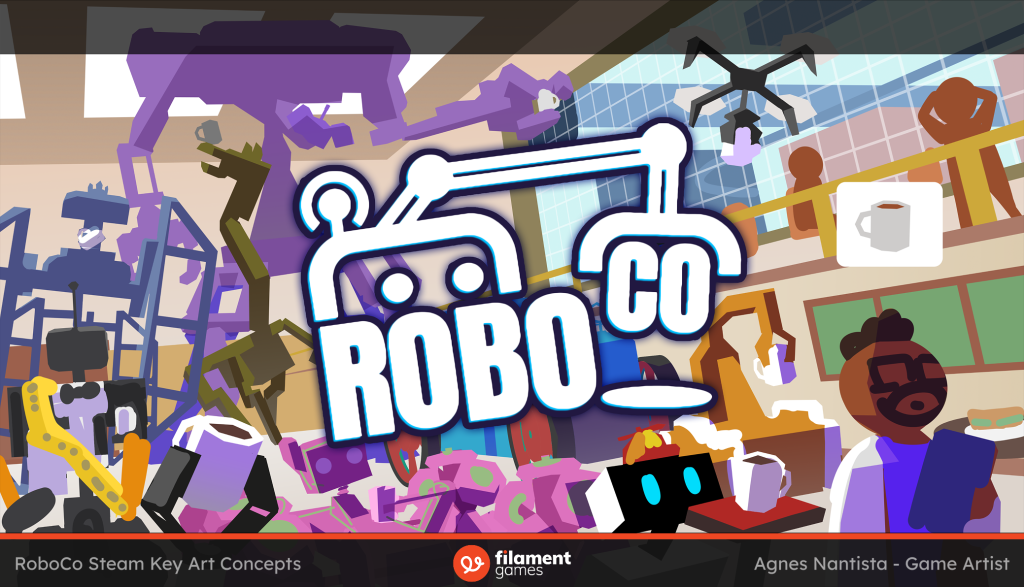
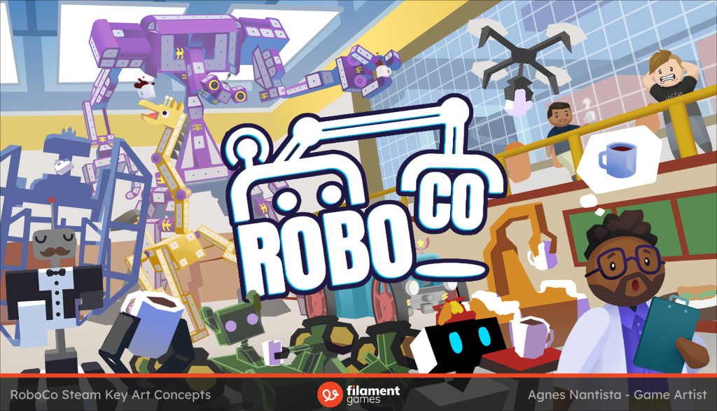
The final color decisions were to stick to a strict one-color identity per bot to ensure they wouldn’t jumble together and then darken the back wall so the logo could stand out better.
Next, I hunkered down to draw every missing detail I wasn’t previously focused on. This included the walls, warehouse, and floor; it’s better to get everything to a finished level than trying to make one part perfect. That way, if I spontaneously combust tomorrow, the artwork is at least shippable.
As an easter egg we decided to make the two characters in the back based on two Filament employees! The coffee sipper is a former producer of the project and the panicked metal fan is the same senior artist who helped out with this piece!
The biggest leap from the previous image is that vibrant blue in the background! I had played around with the idea earlier, but was too focused on keeping the cafe strictly warm. Making this change really made the bots pop out as warm objects against a cool background! It’s also a slightly different blue from that of the warehouse, so that environment distinction is still intact. To further ensure the bots were visually separated, I also added a rim light to them all. It always adds a little punch that makes things feel more grounded in a space!
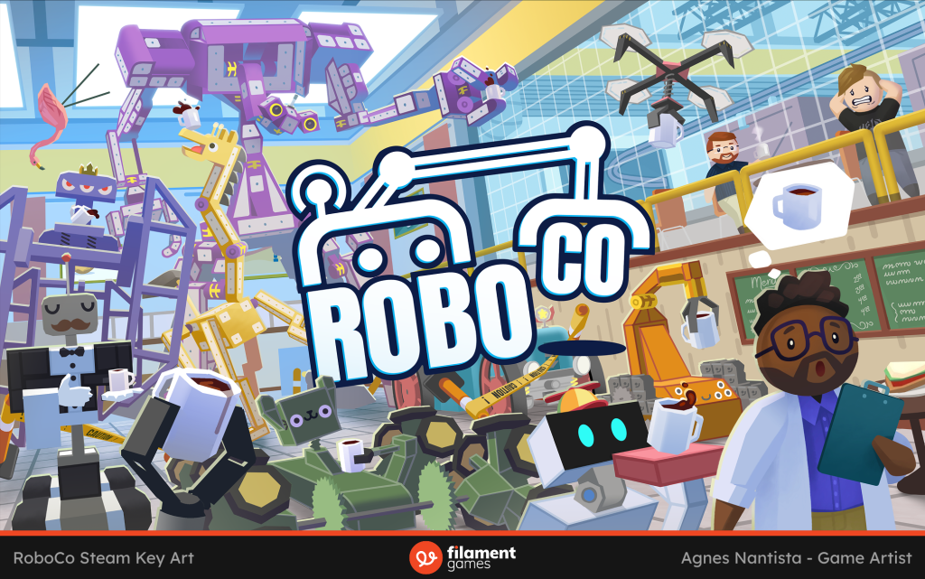
I then took one final day to add some destruction in the scene. In RoboCo, a lot of the humor comes from bumping into objects and the ensuing ragdoll physics, so these garnishes would make the piece complete. I tried flipped tables, coffee puddles, and plants, but we settled on caution tape and a yard flamingo, which is a callback to the very first key art.
It was then that I deemed the piece finished and felt the blessing of satisfaction wash over me.
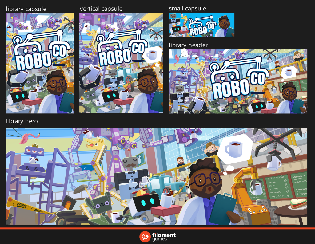
BUT WAIT! I still had to make the other capsule sizes. These took close to another day because they’re hand-crafted to optimize each and every aspect ratio! It felt like putting puzzles together, which is fun and challenging in its own right.
Thank you for reading my first ever blog post! It was a nice change of pace to be able to flex my writing muscles and give my drawing ones some recovery time. The work for this piece was spread across 11 days. I hope this was enlightening or entertaining to read no matter your artistic experience!