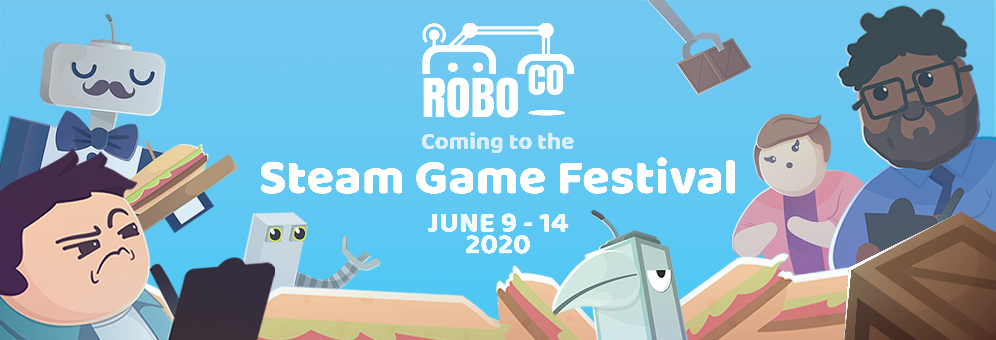

Across Karman is an interactive web experience developed with the Wilson Center that focuses on space systems and global collaboration. Users explore an orbit-based interface to understand how satellites and space infrastructure support everyday life.
Explore →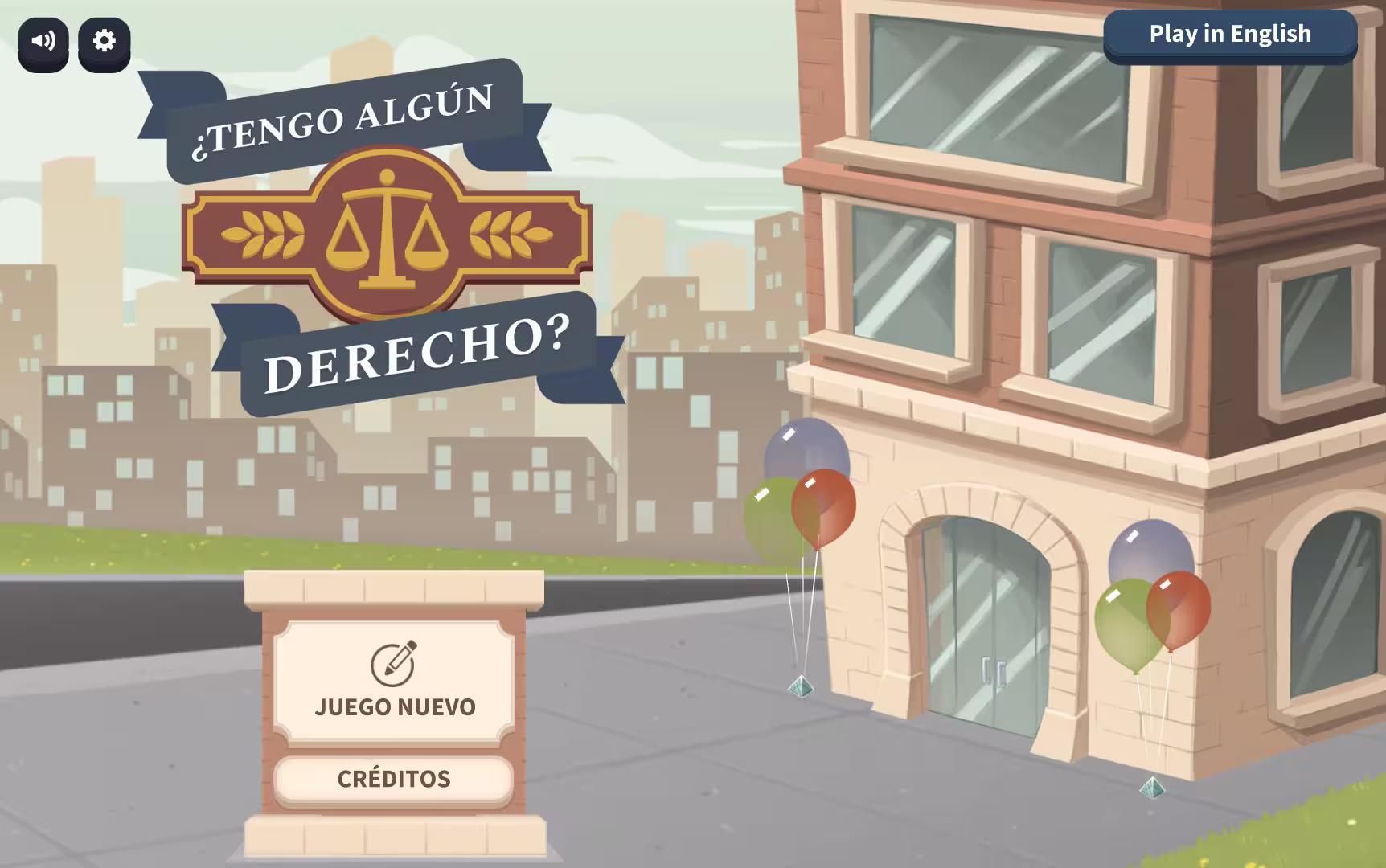
Do I Have a Right? is a civics learning game developed with iCivics that teaches constitutional law through interactive legal scenarios. Players run a law firm, determine whether clients’ rights have been violated, and argue cases based on the Bill of Rights.
Explore →Most educational game developers know the basics of accessibility: add alt text, check contrast ratios, and support keyboard input. But beyond those essentials, there’s a second layer of UI design decisions – subtle, structural, and often invisible to those without firsthand experience of disability. These “hidden barriers” aren’t flashy. They’re baked into everyday assumptions about how players navigate feedback, controls, and pacing. For learners who rely on assistive tech or who process information differently, these choices can determine whether a game feels empowering or impossible. In this post, we’re diving into a few of the most common design patterns that slip through even well-intentioned accessibility efforts. By spotting them early, educational game developers can save themselves time and ensure a learning experience that welcomes every player from the start.
Relying on color to communicate meaning seems harmless, until it becomes the only way information is delivered. Educational games often lean on green highlights to show correct answers and red to flag errors. It’s intuitive if you have perfect color vision, but roughly 300 million people worldwide don’t. Red-green color blindness is the most common form, and when your UI is built around that contrast alone, critical cues get lost. The fix isn’t to avoid color altogether. Color is an invaluable communication tool that adds speed, emotion, and hierarchy. That being said, it should always be paired with something else: an icon, a label, a pattern, or a sound. The moment a game mechanic depends entirely on whether a learner sees one hue or another, it’s time to rethink that interaction.
While they might seem slick when you’re using a mouse to navigate, hover-based interactions create gaps in information flow, especially in learning games where instructions, hints, or menu details might appear only when a mouse pointer pauses over an element. Devices without a cursor or players navigating without one simply won’t see that content. Accessible game UIs treat hover as optional and never required. Any hover-triggered element should also respond to focus events or clicks. This ensures that students using switches, joysticks, keyboards, or touch can access the same information in ways that match their input needs. Better yet, expose help text without requiring a trigger at all because in a learning context, clarity should always win out over cleverness.
Visual clarity is both an aesthetic imperative and the sturdy backbone of usability. Low contrast text, overly decorative fonts, and minuscule labels are all design choices that quietly shut out players with low vision, aging eyes (this author included), or attention-related challenges. For learners in classroom settings, poor lighting or secondhand devices can exacerbate the issue. Following WCAG’s AA-level contrast ratios is a great start, but it’s not the ceiling. Larger font sizes, simplified typography, and user-adjustable UI scaling can dramatically increase comfort and comprehension. Just as importantly, avoid hiding information in small-print UI elements. If a text box or status message is essential to gameplay, it should be designed like it matters.
Time-based gameplay can make a learning activity feel lively, but it can also amplify stress, particularly for students with motor disabilities, anxiety, or processing disorders. A 2023 study on Kahoot! and Quizizz found that older adults often struggled with games that advanced too quickly, citing a lack of control and clarity. Younger learners may not articulate the same feedback, but the impact can be just as limiting. Game-based learning should create space for mastery, not just speed. Adjustable timers, optional relaxed modes, and clearly visible countdowns all contribute to more inclusive pacing. When time pressure is a core part of the game loop, players should at least have tools to prepare and respond, not be blindsided by auto-advancing screens or sudden lockouts.
–
Accessibility in games doesn’t have to be complicated. When teams take time to question default patterns and design with a wider range of learners in mind, the results are more thoughtful, more usable, and more effective for everyone. Every small decision adds up to a better experience – a lesson we’ve learned building accessible experiences for our clients. Contact us to learn how we can help you build games that are accessible, engaging, and ready for every learner.
Best practices for preventing motion sickness while maximizing learning outcomes.
Best practices for preventing motion sickness while maximizing learning outcomes.
Get the latest Game-Based Learning Review content delivered to your inbox, including new articles, videos, and industry insights.