
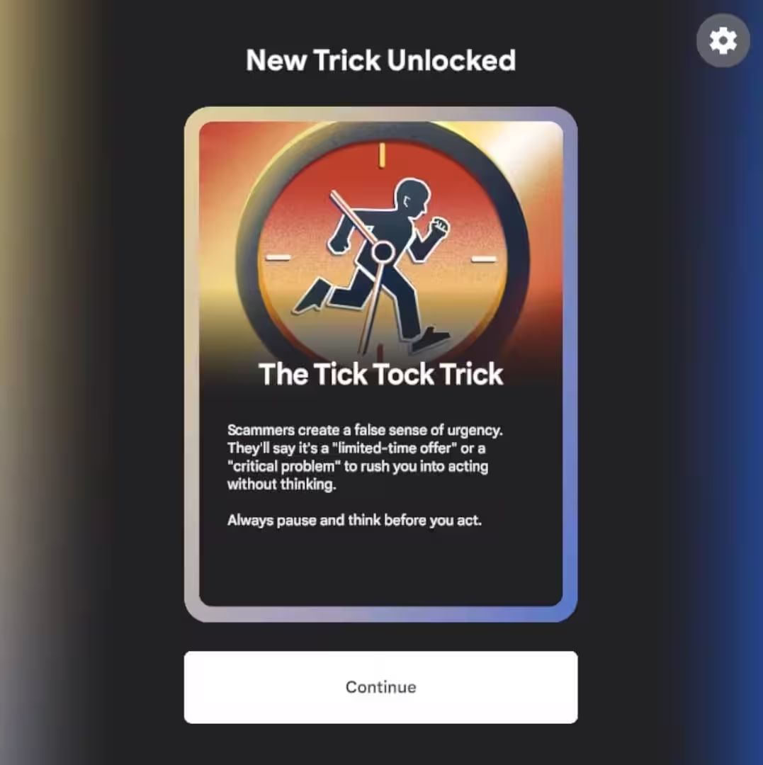
Be Scam Ready is a free, browser-based learning game developed with Google to help players identify and avoid online fraud. Players explore short, interactive scenarios across multiple characters to recognize the manipulation techniques used in real-world scams.
Explore →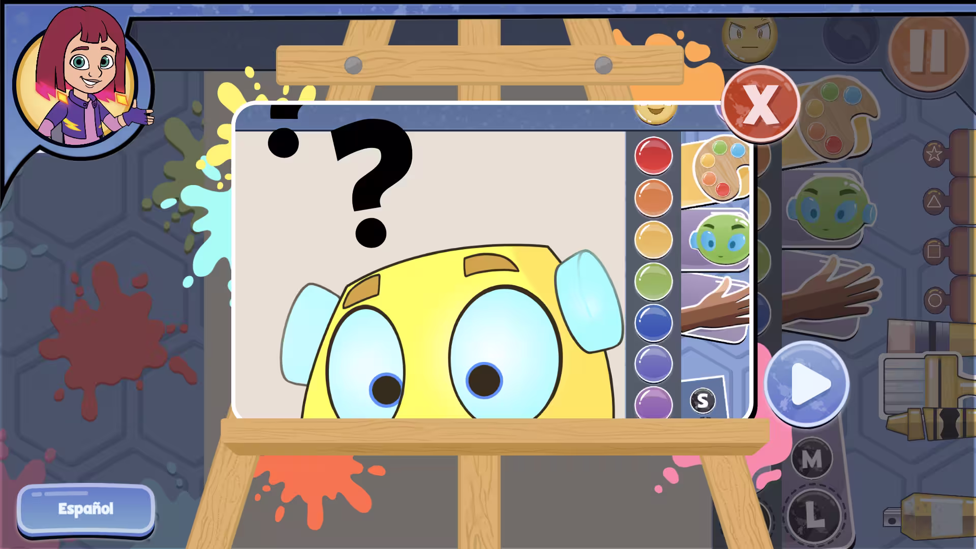
Works of Heart is an arts learning game developed with Twin Cities PBS that focuses on self-expression through painting. Players identify emotions through guided prompts and create artwork using a range of tools and colors.
Explore →Meeting WCAG 2.1 AA standards is a requirement for many game-based learning tools used in schools or public agencies, and compliance is a complex process. Even experienced developers and designers might come across terms like programmatic labeling or pointer cancellation without being clear on what they actually require. Fortunately, we’re here to help! This glossary explains the most important accessibility terms for teams building educational games or web-based interactive content. Each entry reflects best practices and actionable design principles aligned with recognized WCAG 2.1 AA guidelines.
WCAG 2.1 AA: The Web Content Accessibility Guidelines, version 2.1, level AA, outline how to make digital content accessible to users with disabilities. They provide the standard used by most school systems and federal agencies.
Section 508: A U.S. law that mandates accessibility for all digital technology used by federal institutions. Most agencies follow WCAG 2.1 AA to meet this requirement.
POUR: An acronym for four principles that form the basis of all WCAG guidelines:
Semantic Markup: Code structure that defines the role of each element using standard HTML. This allows assistive technologies to identify content types and navigate accordingly.
Programmatic Labeling: Code-level descriptions that clarify the purpose of interactive elements. Common examples include aria-label, alt, or associated label elements for inputs and buttons.
ARIA (Accessible Rich Internet Applications): A set of attributes that add accessible names, roles, and states to custom interface components when semantic HTML alone is not enough.
Accessibility Tree: A structure created by browsers that assistive technologies use to interpret your content. If a UI element is missing from the tree, it will not be recognized by screen readers.
Alt Text: Descriptive text that explains the purpose of non-text elements like icons or images. Decorative visuals that convey no content or function do not require alt text.
Focus Management: The system that determines where keyboard or assistive focus lands during interaction. This includes setting initial focus, keeping tab order logical, and returning focus after modals close.
Keyboard Navigation: The ability to interact with all interface elements using only a keyboard. This includes using Tab, Shift+Tab, Enter, and Space to navigate and activate elements.
Tab Order: The sequence in which focus moves between interactive elements. It should follow the logical structure of the interface and match user expectations.
Captions: On-screen text that reflects spoken dialogue and essential sounds in prerecorded media. Required for content like cutscenes or explainer videos.
Transcripts: Full written versions of audio content, often used when captions are not present or when users prefer a text-based alternative.
Color Contrast: The brightness difference between text or interactive elements and their background. Standard body text must reach at least 4.5:1, while large text or UI components must meet a minimum of 3:1.
Flashing Content: Visuals that flash more than three times per second can trigger seizures. Developers should avoid these or provide clear warnings and user controls.
Text in Images: Text placed inside images cannot be accessed by assistive tech. When using images for instruction or feedback, provide the same information in a text-based format as well.
Several frequent issues can affect the accessibility of games and interactive content. One of the most common problems is the keyboard trap. This occurs when a player can tab into an element like a modal or a menu but cannot exit it using the keyboard. To avoid this, make sure focus flows logically and includes a clear way to close or return.
Another common issue is missing or inconsistent focus indicators. When a player navigates with a keyboard, they must be able to see which element is selected at all times. The indicator should have sufficient contrast and should remain consistent across similar components.
Color should not be the only way to communicate feedback or status. For example, marking correct answers in green and incorrect ones in red is not enough. Add shapes, icons, or labels so the same meaning is conveyed to players who are color-blind or using grayscale settings.
Games that feature long-running motion or animation must include a way to pause or stop it. This helps players who are prone to distraction, discomfort, or sensory overload. A standard pause screen is usually sufficient as long as it halts gameplay and background movement.
Games that meet accessibility requirements must support a range of inputs and assistive technologies. Players should be able to complete every essential action using a screen reader, keyboard, or compatible device. This includes submitting answers, navigating menus, and activating controls.
Complex input patterns, such as swipe gestures or multi-finger actions, should always have a single-point alternative. A tap or keyboard input must be available whenever possible. This ensures that players using switch devices or alternative controllers are not excluded from core gameplay.
Pointer cancellation is another required behavior. Players must be able to cancel a tap or click by moving away from the target before releasing. This helps reduce errors caused by involuntary motion or accidental touches.
All interactive components must expose their name, role, and value through code. A button that looks correct but lacks a proper label will be skipped by assistive tech. Make sure your interface communicates function and state clearly to all users.
Although some reflow-related guidelines do not apply to games, interfaces must still remain functional and legible at 200% zoom. This supports players with low vision or those using system-level magnification tools.
Accessibility starts with clarity. When you understand the vocabulary and expectations, it becomes much easier to design interfaces and content that include every player. WCAG 2.1 AA provides a clear framework for doing that work, and for getting your games adopted where it matters. Looking to get your games ready for upcoming WCAG deadlines? We’ve done it before and we can do it again – contact us today!
Best practices for preventing motion sickness while maximizing learning outcomes.
Best practices for preventing motion sickness while maximizing learning outcomes.
Get the latest Game-Based Learning Review content delivered to your inbox, including new articles, videos, and industry insights.


